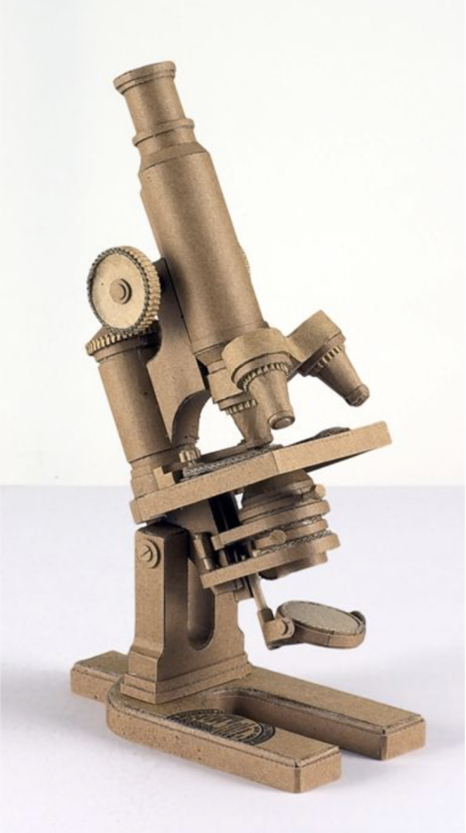
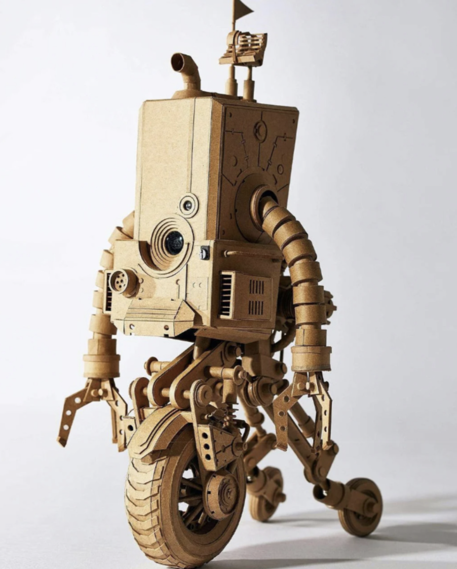
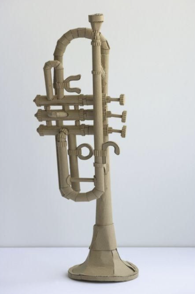
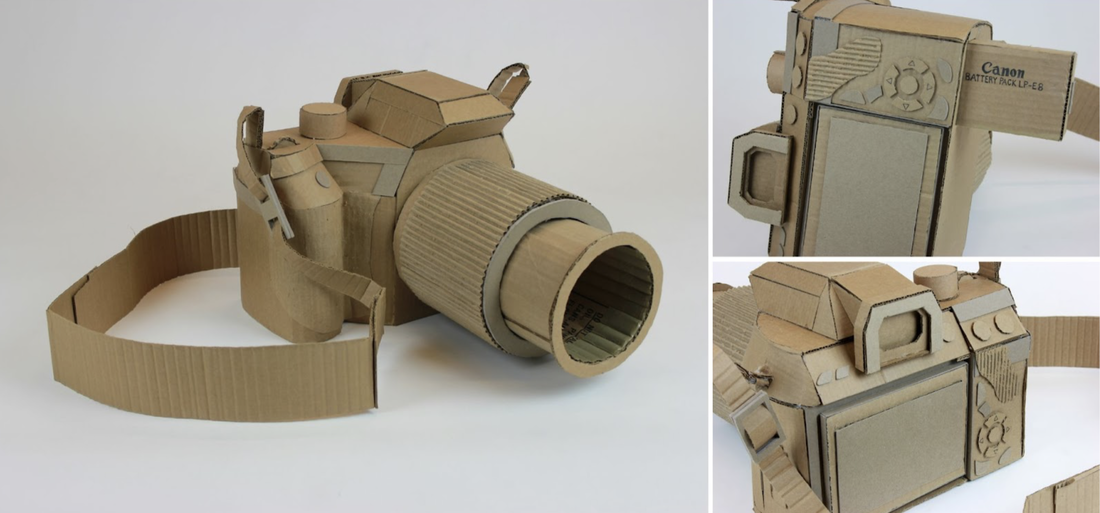
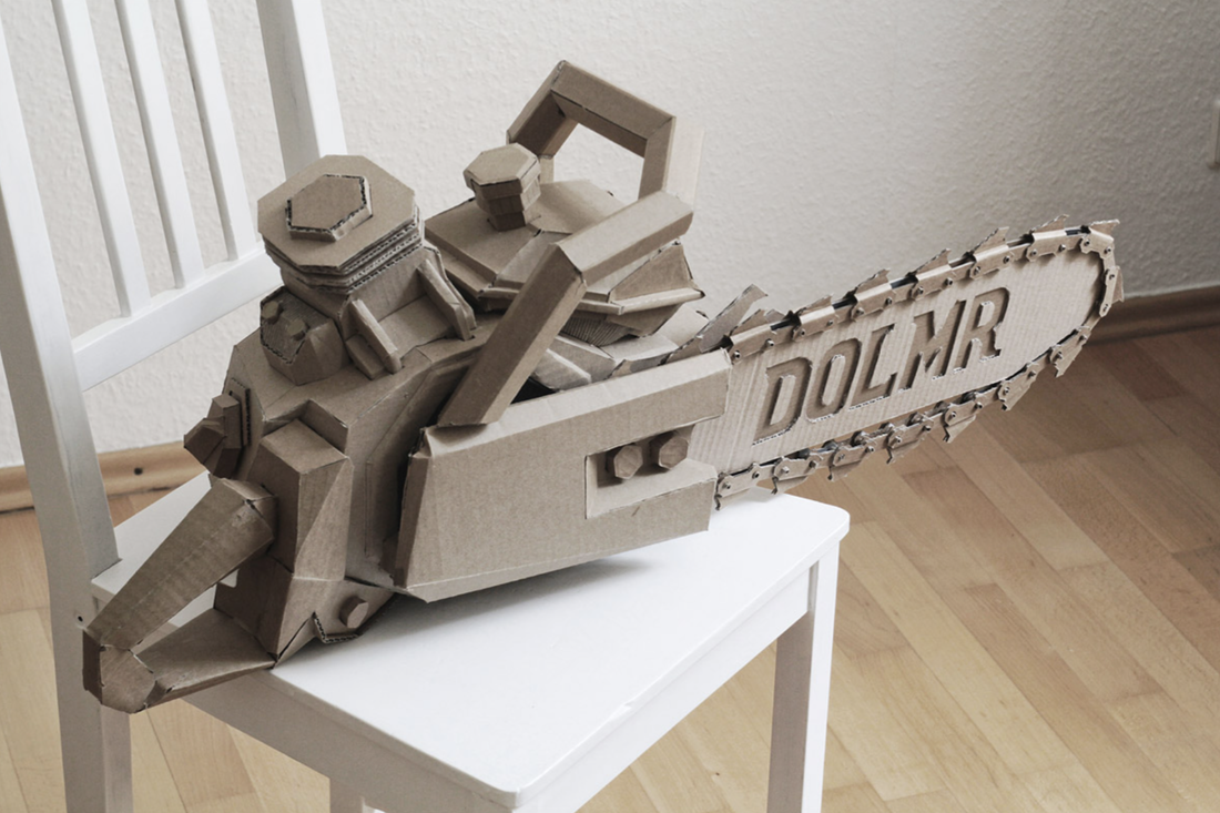
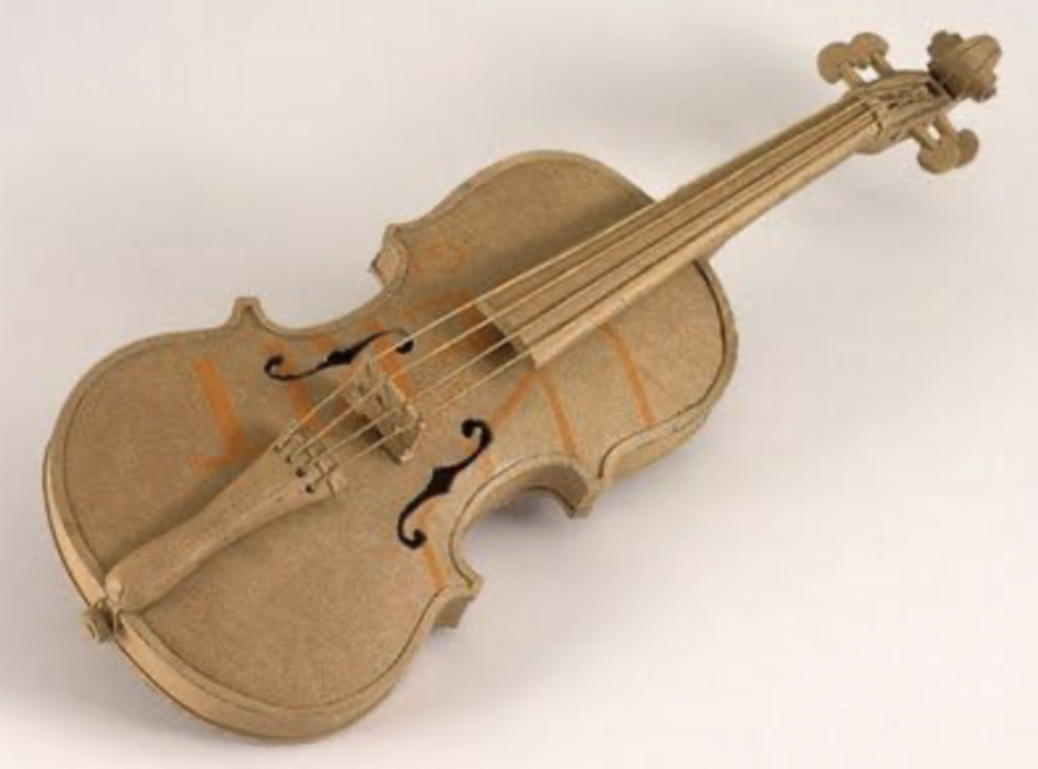
DRHSART
  • About
    • Scholastics
    • Take Art!
    • The Creative Corner
    • Jackson Pollock Collaboration
  • Studio
    • ART 45 >
      • Art 45 Assignments Blog
    • Art 3 >
      • Art 3 Assignments Blog
    • Art 2 >
      • Art 2 Assignments Blog
    • Art 1 >
      • Art 1 Assignment Blog
      • Perspective Examples
  • Gallery
    • DRHSART GALLERY
    • Highlights
    • Student Portfolios
  • Featured Artists
  • DRHSART LEVELS

Frank Moth: Collage Concepts

12/15/2020

0 Comments

 
Picture
Picture
Picture
Picture
Picture
Collage With Meaning
About the Artist
Frank Moth creates nostalgic postcards from a distant but at the same time familiar future. He makes digital collages and compositions with specific, distinctive color palettes, in a critically acclaimed style that is immediately recognizable. Frank Moth was born in Athens in March 2014. He exists as an artist and as an alias for the two people that hide behind him. He has been featured in many publications worldwide, such as Huffington Post US, as well as Buzzfeed and MTV Greece. His work is currently showcased around the world in many galleries online


Artist Statement
The compositions are mainly human-centered. The presence of the human element is obvious, yet perpetually incomplete. There’s always something missing, interrupted, or covered. The face, for example, is usually covered and many times it’s not even there, so as to not surrender its vulnerable introspection, insecurity, and psychic truth without a fight.

Depersonalization/Derealization
In many of Frank Moth’s works people are pictured gazing upon themselves and their own lives on Earth from some distant point in outer space. The perspective of all things always seems to be on a strange verge, between a dream and an urban daily life.
The smothering failure of man to define and refine happiness today within geographic,  temporal, and material {technological and consumerist} bounds, is repeatedly alluded to through the use of old, manipulated paper ads from decades past, as well as old fashion magazines.


Revision/Revival/Rebirth/Insecurity
Many of the artworks feature a subtle expression of companionship or the silent, solitary, obsessive search for it {the people usually have their backs turned and there is a hint of movement in the scenery}, combined with the surreal size disproportion and the disturbed relation between man and his environment/surroundings.
​

Obsession/Music/Pixels/Architecture
This is an attempt to create harmony between people and their surroundings, however imaginary, by using the eternal elements of colours, numbers, simple geometric shapes, symmetry, and subtraction, as well as universal words and concepts like “love”, “together”, “forever”, “never”, “infinity”, “why”.


The Assignment
Now that you have a little more knowledge and understanding of what / who Frank Moth is, your job is to create your own work of art using collage media that feels like Frank Moth.  This sounds easy, but you'll soon find out that it is absolutely not that.   

Before we begin, you will be put into teams and will be challenged to look through the work on his website and answer some difficult questions about what you see recurring in the work.   Each student in the group will be required to complete a Schoology assignment, but you are able to collaborate with each other to discover the answers to the assigned questions. 


The Criteria and Expectations
Your final image should be created on a surface that is no smaller than 8.5" x 11", and no larger than 11" x 14". 

You must use physical collage media for this assignment, so find yourself some interesting print media to deconstruct, rearrange, and assemble. Your media can come from magazines, postcards, computer print outs, old photographs, books, or any other source of printed media in which you find inspiration. 

Your final work of art will need to Include an artist statement.  That statement will be a separate grade, and you will be given clear directions about how to craft that statement that goes with the work of art you've made for this challenge. 

0 Comments

The Thankful Project

11/18/2020

0 Comments

 
Picture
Picture
Picture
What Are You Thankful For?
This will be a quick assignment that gets us all in the right mindset as we approach the Thanksgiving holiday.   For this project I want you to choose one thing for which you are truly thankful.  After choosing it, take a well arranged photograph of it to be used as the resource for your illustration. This particular illustration will be created using a loose watercolor technique with colored pencil applied over the surface for more detailed resolution.  The final image should contain both a loose and tight quality at the same time. 

Watch the video below for guidance on the technique you'll be using in this project:
The loose watercolor with colored pencil combination is a great way to make a quick and striking illustration.  

When choosing your image, understand that it doesn't have to be a portrait.  It can be an object or even a concept rather than a portrait.  What's most important is that you have a deep gratitude for something in your life, and that that you are willing to pay homage to that in an illustration.  


Begin the illustration with a light proportional sketch in graphite of your subject. As you begin to add the watercolor after your sketch is complete, make sure to start with the lightest colors on the value chart.  I find it helpful to start with light yellows first, then work my way toward oranges, browns and reds.  I like to add my blues and purples last to give it that pop and contrast.  Working in this way allows you to build the values slowly without getting too dark too fast. 

Leave loose ends with your work, and don't be scared to let the watercolor drip some.  Those uncontrolled drips can add so much expression and energy to the image you're creating. With this illustration, I want you to allow things to float a little bit. Give them atmosphere and room to dissolve. 

There's a term many illustrators use called "Selective Detail".  That's what I want you to seek in this work of art you are making.  Give us the details, but only where they are absolutely necessary.  Let the watercolor be loose where the resolution isn't as needed. 

Above all else, have fun with this project.  Be expressive, experiment, and enjoy walking the line between controlling the medium, and letting it do what it does by nature. 
0 Comments

The Personal Learning Manual

9/2/2020

2 Comments

 
Picture
Picture

Students Will:

Design a multi-slide instruction manual using Google Slides that will help me understand how to be their best teacher possible.

The Timeline

Students will have the first week of school to complete this assignment.  The due date will be posted on the Schoology calendar for this course.  Directions for turning the work in will be attached to that Schoology assignment. 

The Directions 
Create one slide or page of your manual for each of the topics in the list below these instructions.  You are welcome to expand upon the required number of pages, but you must at least include a page for each heading. 

  1. Cover Page (Make it Fun and Personal)
  2. My Identity
  3. What I'm Good At
  4. How I Learn
  5. Triggers and Pet Peeves
  6. What Makes Me Nervous About This School Year
  7. What I Hope to Learn This Year
  8. What Makes Me Happy

Be Yourself
I want this manual to exude your personality and teach me about you through the means by which you feel most comfortable expressing yourself.  Some of you may want to draw or illustrate your manual so that can get a sense of your passion for making art.  Others of you may want to use photos, or simply just words to communicate with me.  Whatever you decide to do, I want you to have the freedom to express yourself the way you want.   That’s what art is truly about. 
2 Comments

The Extreme Perspective Portrait

10/4/2019

0 Comments

 
Picture
GO EXTREME!

In this assignment students are expected to render a portrait of themselves, a friend, or a family member from an unusual and extreme perspective.  The students can create these works of art on any surface they'd like to use so long as it is at least 11"x14".   They may choose any media or style to complete the work.  Provided below are many different stylistic options that can provide some guidance and inspiration for those students who feel a little intimidated or stuck at the start. Above anything else, this drawing is aimed the EXPRESSION of mood or emotion.   These drawings will be graded on the overall design of the space, the craftsmanship and control of the media, the expression of mood or emotion, and the overall creativity of the image as a whole. 

0 Comments

The Still Life Self Portrait

9/4/2019

0 Comments

 
Picture
Picture
Picture
Picture
Picture
Picture
Picture

STILL LIFE SELF PORTRAIT

This first big project of the year is aimed at helping students demonstrate their current technical and creative understanding.  In this project, students will arrange a dramatically lit still with objects that unveil aspects of their character. This assignment allows students to unveil things about their interests, habits, passions, fears, etc through a still life that acts as a portrait. 

The students can work on any surface and on any scale that is at least 11 x 14 inches.   The students have the freedom to work in the medium with which they are most proficient, as this first project will act as a measure of their technical skills and conceptual abilities.  

When arranging the still life, the student should use dramatic light to increase the drama and expression of the image.  Photographs should be taken of the still life to be used for reference when drawing. When arranging elements for the still life, the students must choose a minimum of 4 objects that have personal meaning, and those objects should showcase a variety of surface texture.

This assignment will be assessed both for an actual grade in the course, and will also be used as the initial Student Growth Measure score (SGM). 

The SGM will be scored on a scale of 1-7 in the following categories:
Elements and Principles of Design
Vision / Independence
Technical Control

Categories of the SGM that are not scored for this project include the following:
Visual Journal
Portfolio Development

​


0 Comments

In Our Time:  From Digital To Physical

3/1/2019

 
Picture
Picture
Picture


​  DOWNLOADS
AB EX > POP > PRESENT
File Size: 4772 kb
File Type: pdf
Download File

Silent Critique Directions
File Size: 557 kb
File Type: pdf
Download File

In Our Time

Project Description:
The IN OUR TIME unit explores the history of art in the 20th century, focusing on Modern Masters such as Picasso, Dali, Rothko, Pollock, Rauschenberg, Rosenquist, Warhol, and Jeff Koons.  As we discuss the evolution of art over the 20th Century, the students will create digital collages that are inspired by recent global and domestic events.  Once complete, those digital collages will become references for mixed media paintings.

The final products will clearly indicate inspiration from Rauschenberg and Rosenquist, as the students will borrow the color, pattern, rhythm, and arrangements used by those artists.  The final products will have a similar DNA to the studied artists works, but will contain content that speaks the language of contemporary culture.

Past Student Examples

Project Criteria:

Designs clearly show the influence of the color, composition, and overall aesthetics of Rauschenberg and or  Rosenquist.

Students should be able to explain how they were inspired by the studied artists, and how they borrowed  elements from the works of those artists during our verbal critique.

Designs should contain at least 5 images

Photoshop designs should contain at least 5 layers 

Students used Photoshop to create a custom designed brush in at least one area of the digital collage.

Designs contain a  clear connection to contemporary culture or a specific personal narrative that is aligned with the past year of life.

Designs should include at least one piece of collage material, and one gel transfer, in addition to the painted and drawn areas. 

Helpful Tips for Design:
As you create your design, remember that you will have to translate the digital collage into physical media.  This means that you will be using paint, collage, gel transfer,  and drawing materials to re-create your digital work.  Be aware of how complicated your design becomes.  The examples I've posted on this page will help you see the power of simplifying your design.  Painting is no easy task, so do yourself a favor and keep your design simple to save yourself some frustration as you paint.

Printing in color and pasting the image or transferring the image can be a great way to save some time with this project.  You are encouraged to use collage for some of the more complex design elements.  

How do you value ART?

9/3/2018

0 Comments

 
Picture
Establishing Hierarchy
For this assignment, the students are put into small teams, and are required to arrange images they may or may not have seen before into a hierarchy of "most artful" to "least artful".


If done properly, the activity forces students to fight for their own taste, and engages the group in a dialogue about what they value most in a work of art.  This process helps the students realize the subjectivity of art.


As the students work in groups to arrange the order of merit among the images they've been given, they are also asked to defend their position as a group in an informal presentation to the class.  As a class, we will look at the top three and bottom three images chosen by each group, and those groups will discuss why they chose to put the images in that particular hierarchy. 

As they present the images, the instructor gives the students the background context of the images they chose, in an effort to help the students understand that knowledge often feeds appreciation, especially with art.

Defining Art
File Size: 11785 kb
File Type: ppt
Download File

0 Comments

Understanding Non-Objective : An Exercise in Printmaking

1/30/2018

5 Comments

 
Picture
Picture
Picture
During this assignment, the Art 1 students will be taught about various printmaking techniques, and will be guided through a lesson that challenges them to create non-objective monotypes.  

Let’s face it, non-objective art is very misunderstood by the masses. I wish I had a nickel for every time I've been in a museum or gallery and heard the phrase "my five year old could do that!".  The aim of this unit is to help our Art 1 students understand the value of non-objective abstraction by creating a series of monotypes that borrow elements from several artists who work non-objectively.  Below is a list of artist whose work will be discussed in this unit.

Peri Schwartz
Cindy Neuschwander
Deborah Zlotsky
Tanja Softic
Heidi Trepanier
Mary Scurlock

Sally Bowring
Rob Szot


We will begin this unit by discussing a variety of printmaking techniques and terms.  We will then have a demonstration about one of the many monotype techniques before students are given the freedom to design their own non-objective abstract images on their plexiglass plate.  Each student will be required to create three different non-objective monotypes. Each of the three prints must demonstrate a heavy stylistic influence from the artists whose work is discussed in this unit. Each print must be labeled on the back with the list of artists whose work influenced that print. 


Process for design inspiration:
Students are required to create a digital folder for each of the artists we discussed in class (8 total artists). Then, the students take class time to thoroughly investigate the work of these artists, and collect a minimum of 5 images they enjoy most from each artist. Then, they are to create a Google Document that contains their favorite image from each artist. The images on that document should be resized so they all fit on one page of the document.  These 8 images from that will be printed, cut out, pasted into their sketchbooks, annotated, and used as the inspiration for their three monotypes.  Here is an example of how the students will annotate the images once they've been pasted into the sketchbook.
​

This lesson was inspired by the book "Steal Like an Artist" by Austin Kleon. The reasoning behind inventing this assignment was to have the student explore non-objective abstraction with a little bit of guidance from artists whose work has been recognized by the art world. If we take the time to look at successful artwork, deconstruct it, reorganize it, and combine it, the results are more likely to be successful.

Critique:
The critique process will take place in small group presentations. As the students show their work, they are required to bring their sketchbooks that show the 8 works of art that inspired their series of monotypes. As they present and are critiqued, the students are required to articulate what elements they borrowed from each of the seven images as they worked. This discussion will push the dialogue about what makes a non-objective image successful and interesting.

Students will be graded on having completed 3 prints that are properly signed with clean and even borders. They are also graded on how well they articulate the specific inspiration for their work, and how familiar they are with the eight artists we studied during this assignment.  Students must create 3 prints that somehow address the stylistic qualities of all 8 works of art that were chosen as the project's inspiration. 

Self Evaluation
Grading Breakdown

Matting
Once the students have been critiqued and have documented their work on their websites, they will choose their best print to mat. A demonstration will take place, and all students will be responsible for learning to mat their own work.

Mixed Media Follow Up
The follow up to this assignment is to take those prints that didn't come out as well as the students had liked, and re-work them with mixed media to bring them to life. There are no limits to what can be done in this stage of the process, and experimentation is highly encouraged.

5 Comments

Mixed Media Perspective

3/7/2016

1 Comment

 
Picture
Picture
Picture
Picture
Picture
Picture
Picture
Picture
Picture

​What is Mixed Media?

The term "mixed media" refers to artworks that are created through the use of more than one type of artistic medium.  Often, the artists use some form of collage in combination with drawing and painting media.  In our case, we will be working with collage, acrylic, graphite, ink, and colored pencil.  

Materials for this project:
11"x14" Masonite Board
Magazines, Newspaper, Old Books, etc.
White Acrylic Primer or Gesso
Acrylic Paint
Graphite Pencil
Pen (ball point or sharpie)
Prismacolor Pencils
Photo Reference of a building in perspective


Timeline for this project:
Day One:  Lecture / Practice
Day Two:  Collect Imagery for Approval / Collage 
Day Three:  Begin Drawing
Day Four:  Mixed Media Drawing
Day Five:  Final Day to work
​Day Six:  Critique

What Will You Create?

The students will begin with creating a collaged background on a 11"x14" sheet of Masonite board.  The students should seek a variety of typographic elements, and should tear the collage media rather than using mechanical tools such as Exacto knives or scissors. Absorbent papers, such as newspaper, will work better than glossy textured magazine pages.

Once the surface has been covered with the collage media, the students will "quiet" the typography with a light wash of white acrylic primer.  This should be done in a very expressive way, and should leave some evidence of the typography below the surface of the primer.  When the primer has dried, the students will stain the surface with watered down acrylic paint.  Drips, splatters, and irregularities are welcomed in this stage of the mixed media drawing.

​Next, the students will use a pencil and a ruler to illustrate, using the rules of linear perspective,  the building that was chosen as a reference.  The structural marks of these perspective drawings should be made lightly, and should be mostly disguised when the image is finished.

Once the students have completed the basic structure of the building, and have proven an understanding of linear perspective, they will begin to loosely render the drawings with layers of diluted acrylic paint. The students will use their photo reference to guide their color choices, and students are encouraged to paint with "selective detail". The amount of detail used in the painting is up to the students, and the treatment of the paint should be aimed at expression more than mechanical precision.

At this point, the students should feel free to add small details with pencil and pen, but should continue to keep things fairly loose and expressive. Once the line work has been completed, the students can decide what other elements their work may need. Some students will add more collage elements, some will embellish the drawings with colored pencil, others may add layers of acrylic paint.  The quality of the finished product should seem heavily layered and expressive.


What is Linear Perspective?

Helpful Links:
One Point Perspective Tutorial
Two Point Perspective Tutorial
​

Examples of One and Two Point Perspective:
Boxes In One Point Perspective
Street Scene in One Point Perspective
​Box Letters in One Point Perspective
Boxes in Two Point Perspective

Linear perspective
, a system of creating an illusion of depth on a flat surface. All parallel lines (orthogonals) in a painting or drawing using this system converge in a single vanishing point on the composition’s horizon line.

Linear perspective is thought to have been devised about 1415 by Italian Renaissance architect Filippo Brunelleschi and later documented by architect and writer Leon Battista Alberti in 1435 (Della Pittura). Linear perspective was likely evident to artists and architects in the ancient Greek and Roman periods, but no records exist from that time, and the practice was thus lost until the 15th century.

The three components essential to the linear perspective system are orthogonals (parallel lines), the horizon line, and a vanishing point. So as to appear farther from the viewer, objects in the compositions are rendered increasingly smaller as they near the vanishing point. Early examples of Brunelleschi’s system can be seen in Donatello’s relief St. George Killing the Dragon (c. 1416–17) and Masaccio’s painting The Holy Trinity (1425–27), a dramatic illusionistic crucifixion. Andrea Mantegna(who also mastered the technique of foreshortening), Leonardo da Vinci, and German artist Albrecht Dürer are considered some of the early masters of linear perspective. As the limitations of linear perspective became apparent, artists invented additional devices (e.g., foreshortening and anamorphosis) to achieve the most-convincing illusion of space and distance.
1 Comment

Drapery Drawing:  Seeing Light and Shadow

10/2/2015

1 Comment

 
Picture
Picture
Picture

Drawing Without Line

The focus of this drawing activity is to train students to see the nuance of light and shadow.  This is a value study that requires the students to draw “linelessly”.  The final product should have a full range of values (lightest light to the darkest dark , with subtle values between), should fill the entire picture plane effectively, and should be absent of hard lines that might cause the drawing to look flat. These drawings will be evaluated heavily on craftsmanship and the control of the medium.
View a Time Lapse Drawing Example
Seeing Basic Forms in Drapery


THE RUBRIC
TIME ON TASK  25 points
This category measures the artist's willingness to work outside of the scheduled studio time to get the work ready for critique.  Additionally it measures the artists level of focus during the assignment.

CRAFTSMANSHIP  25 points
Drawings should be free of wrinkles, smudges, or tears, and the artist should demonstrate control over the media.  This category refers to the overall care taken with the work.

FOLLOWING DIRECTIONS  25 points
This category measures the artist's subtle use of shading to produce the illusion of three dimensional form.  There should be little evidence of line in the finished product.  These works were to be done on a full sheet of 18”x24” paper with charcoal.

OVERALL DESIGN  25 points
The space should be used in a way that recycles the eye and keeps it in constant motion throughout the space.   There should be enough contrast used so that the drapery is visible on the page.  Most importantly, the space should not have empty voids that the get unnoticed.  The subject should fill the space effectively, and should look as if the artist was in control, rather than the drawing being in control.
1 Comment
<<Previous

    ART 2 
    Assignments

    This blog is the growing archive of Art 2 Assignments for DRHSART.  You can search assignments by category or date below. 

    Archives

    December 2020
    November 2020
    September 2020
    October 2019
    September 2019
    March 2019
    September 2018
    January 2018
    March 2016
    October 2015
    August 2015
    March 2015
    August 2013

    Categories

    All
    Abstraction
    Art History
    Collage
    Hierarchy
    Icebreaker
    Introduction
    Mixed Media
    Painting
    Portrait
    Printmaking
    Team Based
    Team-Based
    Writing

    RSS Feed

Powered by Create your own unique website with customizable templates.