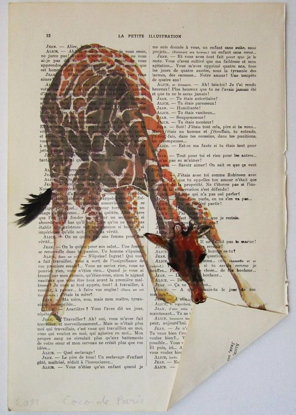
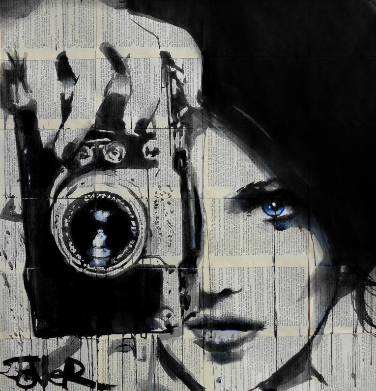
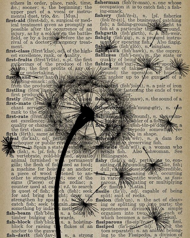
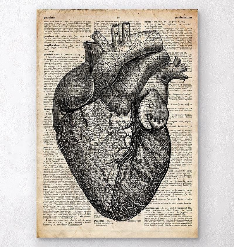
DRHSART
  • About
    • Scholastics
    • Take Art!
    • The Creative Corner
    • Jackson Pollock Collaboration
  • Studio
    • AP 2D ART AND DESIGN
    • ART 45 >
      • Art 45 Assignments Blog
    • Independent Study >
      • Independent Study Assignment Blog
    • Art 3 >
      • Art 3 Assignments Blog
    • Art 2 >
      • Art 2 Assignments Blog
    • Art 1 >
      • Art 1 Assignment Blog
  • Gallery
    • DRHSART GALLERY
    • Highlights
    • Student Portfolios
  • Featured Artists
  • DRHSART LEVELS

Literature + Art

5/1/2023

0 Comments

 
Picture
Picture
Picture
Picture

Literature + Art

Objective:  This project is an opportunity for you to explore the intersection of art and literature, two disciplines that have been intertwined for thousands of years.
​

Your task is to create illustrations on the pages of literature, using the content of the words on the pages as your guide. 

You will read the page you are given and decide what stands out to you as inspiration for your illustration. This will require you to dig deep and tap into your creative instincts, allowing your imagination to run wild as you bring the text to life through your artwork.

Through this project, you have the opportunity to add your voice to this rich history of collaboration between art and literature. So let your imagination soar and create work that is more inspired and technical than anything you've made before. This is your chance to showcase your unique artistic vision and express your soul through the pages of literature. Good luck!

Art and literature have a long and intertwined history, with many examples of the two disciplines working together throughout different periods and cultures. Here are a few ways in which art and literature have collaborated:
  1. Illustration: One of the most direct ways that art and literature have worked together is through illustration. Illustrators create visual representations of characters, scenes, and themes from literary works, bringing the text to life in a way that words alone cannot. Examples of illustrated works include the illuminated manuscripts of the Middle Ages, the woodcut illustrations of early printed books, and the cover art of modern novels
  2. Inspiration: Literature has often served as a source of inspiration for artists. Many visual artists have created works that directly reference or respond to specific literary works, such as the Pre-Raphaelite paintings inspired by the poetry of Tennyson or the many artworks based on Shakespeare's plays. Conversely, writers have often drawn inspiration from visual art, using paintings and sculptures as starting points for their own creative works.
  3. Collaboration: In some cases, artists and writers have collaborated directly on works that combine visual and textual elements. For example, the Surrealist movement of the 1920s and 1930s produced many collaborative works that combined poetry and painting or drawing, often in highly experimental ways.
  4. Commentary: Finally, literature and art have often been used to comment on each other. Writers have used artworks as metaphors or symbols in their writing, while artists have created works that critique or satirize literary conventions or themes. This kind of cross-disciplinary commentary can often shed new light on both art and literature, encouraging audiences to see each in a different way.
0 Comments

Illusion of Depth with Layers

5/10/2022

0 Comments

 
Picture
Picture
Layers + Holes
Learning Objectives:
  • Control Pressure While Shading
  • Value Gradation
  • Shading Techniques (Hatching, Cross Hatching, Blending)
  • Manipulate Value To Achieve An Illusion Of Depth

Assignment:
​

Create a 4+ layer abstract design with an illusion of depth by applying different values.

Think of a stack of 4 sheets of paper with large cutouts.
​

Each sheet (layer) creates its own drop shadow, each layer is slightly darker in value as you go from the top to the bottom.  

Quick Guide 
Picture
Lightly outline 1st layer cutouts shapes.
Picture
Shade inside your 2nd layer cutout shapes for drop-shadow effect
Picture
Lightly outline the 4th layer cutouts (layer is slightly darker than layer 3)
Picture
Shade inside the cutout shapes for a drop-shadow effect
Picture
Lightly outline the 3rd layer cutouts (layer is slightly darker than layer 2)
Picture
Shade inside your 4th layer cutout shapes for drop-shadow effect
Picture
Lightly outline 2nd layer cutouts (layer is slightly darker than the 1st)
Picture
Shade inside your 3rd layer cutout shapes for drop-shadow effect

Step By Step Process:
Picture
Step One:
​
Layer 1

​Start with drawing 6-7 organic rounded shapes.
​
Leave very little space in between the shapes.

Picture
Picture
Picture
Step Two:
​
Shade inside each shape.
​

Start at the edge (incorporate the outline into the shading).

Value should be placed from dark (at the edge) to mid-value - to light - and to fade


The transition from dark to light (fading or "drop-shadow effect) - should be between 1/2" and 1".

If you shade too dark - use an eraser to lighten the area.

Please take your time!


Picture
Step Three:

Layer 2

​
Start working on the 2nd layer.
​

Draw similar shapes (lightly) - breaking at the first layer's outlines. 

Picture
Picture
Picture
Step Four:

Apply drop shadows to the 2nd layer's shapes in the same manner as you did on the first layer.
​
Use a piece of paper to cover a portion of you drawing to protect it from smudging.


2nd layer's shading should extend all the way to the first layer's outlines.


Picture
Now, that you are done adding the drop shadows, we need to make the 2nd layer appear a little further away. The only way to do it is to change its value.

Picture
Picture
Now the 2nd layer is done and you can move on to the 3rd layer
Step Five:

Use the side of your pencil and very lightly shade the entire 2nd layer to make it appear slightly darker than the top layer.  This will make it look as if it is under the first layer. 

Picture
Picture
Step Six:

At this point - start working with one cutout at a time - do not draw all cutout shapes for the 3rd layer - otherwise it might get too confusing...
​

Layer 3 will go "behind" layers 1 and 2.

Picture
Picture
Step Seven:
​
Shade layer 3 darker than layer 2.

(Compare layers 1, 2, and 3 at this time. There should be a distinct difference in values for each). 

You can shade layer 4 at this time too.


Picture
Picture
Picture
Step Eight:

​Draw cutout shapes on layer 4 that will reveal a dark background.
Shade in the background with a solid consistent dark value. 
Continue working with one shape at a time.

Picture
Step Eight:

Now, that you are done - take a close look at the design.

Add more value where it is needed.

You might want to enhance the contrast of drop shadows near the cutout edges.

Clean (erase) the top layer to remove any spots and smudges.

And......   You're All Done!

0 Comments

Bob Ross + Surrealism Mashup

5/14/2021

0 Comments

 
Picture
Picture
Picture
Picture
Picture

What do you get when you cross a Bob Ross painting with a dream?

This project was voted on and created in collaboration with my students in the spring of 2021.  Students were given the opportunity to make suggestions for the work we would do for our final project of the year. Once I had all of their suggestions, I used a voting website for them to make their choice about which ideas they liked the most and least.  The two projects that rose to the top were combined to create this final assignment of the year. 

To your left you can see some examples of other artists who have done this sort of thing in the past.  With each, there is an element of surprise or humor that provide a new context to the original idillic landscapes, transforming them into something brand new and Pop culture relevant. 

The process...

Step One:
Go to the Bob Ross YouTube channel and look through the many tutorials he has available.  Choose the painting you think would be fun to re-create and watch the tutorial for it.   You will need to brainstorm the ways you'd like to change the original painting to give us that element of surprise.  Have fun with this part! 

Step Two:
Get out your supplies that include a canvas that is approximately 16" x 20".  You should have a variety of brushes and a collection of several paints.  Purchasing these brushes and paints from Michael's shouldn't cost too much money.  You can spend a lot if you want, but they have plenty of affordable student grade materials you can get. 

Step 3: 
Follow along with the tutorial at your own pace.  You won't be able to make your work look exactly like Bob Ross, but whatever happens in the translation will be really fun and interesting if you work hard and do your best.  He creates his images in less than 30 minutes, but I anticipate your painting will take as many as 3 hours to replicate. 

Step 4:
Once you've finished with your tutorial, it's time to completely reinvent the painting and give it a dream-like or unexpected element that makes it more contemporary and conceptual.  If you look at the examples to the right, each has an element of surprise that takes that simple timeless landscape into an era of NOW by using popular imagery.  How you transform your painting is completely up to you.  Take this opportunity to show us your creativity, your wit, your sense of humor.  Make this something the viewer can't escape!
0 Comments

Earth Art:  Inspired by Andy Goldsworthy

10/21/2020

0 Comments

 
Picture
Picture
Picture
Picture
Picture
Picture
 “We often forget that WE ARE NATURE.  Nature is not something separate from us. So when we say that we have lost our connection to nature, we’ve lost our connection to ourselves.”   

"I enjoy the freedom of just using my hands and "found" tools--a sharp stone, the quill of a feather, thorns. I take the opportunities each day offers: if it is snowing, I work with snow, at leaf-fall it will be with leaves; a blown-over tree becomes a source of twigs and branches. I stop at a place or pick up a material because I feel that there is something to be discovered. Here is where I can learn. "

​- Andy Goldsworthy

In his collaborations with nature, Andy works with whatever comes to hand: twigs, leaves, stones, snow and ice, reeds and thorns, creating site specific installations, exploring the very essences of these materials.  In his process, he first must become attuned to his environment mentally, physically, and emotionally.  He listens, he observes, and then when he seems to be drawn to the way the materials express themselves he creates.  He takes these very materials and reweaves them back into the environment in a deliberate manner then lets the effects of the natural conditions have their way with them.  For example, near a stream, he sews together leaves with pine needles and allows the current to carry them as if it were a new inhabitant making its way in the flow.  Another example he  creates a structure from sandstone or shale at the seas edge then observes how the tide interacts with it, carries it away, melts it, or simply flows over it.  In this manner, he is exploring change, transformation, mutability, permeability, the unknown and impermanence.

Your Assignment: 
What Would Andy Do?

Take the time to watch the two videos about his work that are listed below these directions.  After watching those videos and reading the quotes and description of his work on this page, your job is to go out in nature and transform it the way you think Andy might. 

Get a feel for the environment In which you'll be working.  Breathe In the air, become familiar with the materials that are natural to the space. What materials are available in that space that have aesthetic power?  How might you take those materials and create something beautiful that will make others stop, question, smile, and contemplate?

For this project, you will need to spend a minimum of 2 full hours outside in nature building your work. You'll need to keep a log of your hours with details in a google slide presentation that I've provided to you. These work journals are attached to  the Schoology assignment titled "What Would Andy Do? : Work Journal". 

When you've completed the work, you will need to take a clear and creative photograph of the work In Its environment. If you'd rather make a dynamic video of the work in it's environment, that is also an option.  The photograph or video you create is important to giving the viewers an understanding of the installation you've made and how it is woven back into the environment from which it was created.  For this  work of art you may only use the materials available in nature. Nothing man made can be used for this project, and all natural elements must be found in that environment. 
0 Comments

Street Style Self Portraits

1/10/2019

0 Comments

 
Picture
Picture
Picture
Picture

Portraits and Symbolism
Street Style

​The Big Idea
The students will create mixed media self portraits in the style of Shepard Fairey, a contemporary artist whose public work is widely known for it's graphic approach and political undertone.  In this assignment, students are required to produce an image through the stencil process that not only captures their likeness, but also speaks to their personal values or deeper persona. 

Introduction to Shepard Fairey
The following videos will be shown in class to help the students better understand both the process and purpose behind the work of Shepard Fairey.  

The making of a portrait
An Interview with Shepard Fairey
Shepard Fairey's Virtual Reality Exhibition
Shepard Fairey's Official Website

The Process
Stage One:  "Ideation"
After watching the videos and viewing the website of Shepard Fairey, the students are asked to brainstorm in their journals the type of self portrait pose that might summarize or unveil some aspect of their personality or values.  The self portrait will be be simplified, as they will be created through stencils and spray paint, a process that leaves little room for complex detail.  Students will use the cutout adjustment in Adobe Photoshop to simplify the photograph. Before the collage or stencils are created, students are required to write a brief explanation of what they are trying to express in this portrait.

Stage Two:  "The Collage"
Once the students have finished with the overall design of the pose to be used, they are to create the collage surface on which the stencils will be sprayed.  This process is not to be treated arbitrarily, but instead should involve the careful and considerate curation of typography and images that will bring deeper meaning to the stenciled images.  Excellent works of art will contain conceptual meaning in the collage, supporting the graphic portraits that sit upon their surface.   The collages will be created through the layering of newspaper, magazine, found paper scraps, and stenciled or printed patterns. 

Stage Three: Cutting the Stencils
After the collages have been finished and are prepared for the stenciled portraits, the students will need to project, trace, and cut their stencils on the tag board provided.  This is a meticulous and careful process that involves planning. Stencils should not be traced or cut hastily, as exactitude is needed to produce a proper likeness in the work.  Some students may choose to use multiple colors, while others might be content to stick with just a simplified one color stencil.  A detailed tutorial will be given in class about how to translate the digital photograph of the student into a simplified and graphic image much like those used by Shepard Fairey.
​


0 Comments

Printmaking:  Dry Point Etching

2/27/2018

0 Comments

 
Picture
Picture
Picture
Picture
Picture
Picture
Picture
Picture
Picture
Realism, Impressionism, and Etching

The Big Idea:
Students will learn the context of selected European artworks from 1850-1900, and will create dry-point etchings that are inspired by the artworks of that era.


Art History:
Before we begin discussing the Dry Point Etching process, I want to teach you about one of the most widely known eras in art history. Impressionism is probably the most revered art movement by the general public. I want to dive into the details of how the movement became what it was.  Over the next few weeks, we will be discussing some of the important works of art that were made in the second half of the 19th Century.  We will begin discussing the work of Realist artists like Courbet, Millet, Daumier, and Manet. After a thorough discussion of the Realists, we will move into the birth of Impressionism, and will discuss the work of Monet, Cassatt, Degas, and Caillebotte. 

In addition to learning the context of these two important art movements, you will also be learning the process of Dry Point Etching.  To the left, under the famous works of art, you'll see examples of this project from the past.  Those are the types of images we will be creating in this unit. Though it may look intimidating at first, you will all be pleasantly surprised by the outcome of your work. This project almost always yields satisfying results for Art 1 students. 
art1-realism-impressionism.pdf
File Size: 2626 kb
File Type: pdf
Download File


Directions for Dry Point Etching:

Step One:  Choosing Your Painting For Research
You must first choose a work of art from 1850-1900 (Europe). Choose a work of art that interests you, as you will be required to know a lot about it.  You may not choose any of the works discussed by me during the lectures, and the image you choose must be very high resolution.  The detail is everything.

The work you choose will be researched, and presented to the class following the instructions listed later in this blog post. Additionally, you will replicate a cropped portion of the image using the dry-point etching process. 


Here are some resources to guide you:
Art Institute Collection
The Metropolitan Museum of Art
​The National Gallery of Art
The British National Gallery

Step Two:  Cropping and Printing Your Image
Once you have chosen your high resolution image, you need to open it in Photoshop, and crop an interesting 8"x 8" square section of it. There are multiple reasons we're cropping the image into a square.  The first is that it's efficient because we already have the square 8"x 8" plexiglass plates from the mono-printing unit. Another reason we're cropping is to modify the image so we're not just copying.  The third reason is to echo the way the invention of the camera gave late 19th century artists a new "cropped" vision of the world, which had an impact on their compositional arrangements. 

After you have cropped a high resolution section of your chosen image, you need to make it black and white, flip the image horizontally, adjust the contrast for the optimal detail, and print it 8"x8".  You want to be sure it's the same exact size as your plate. 

Step Three:  Etching your plate

Once you've printed and taped your image to the plate, you will want to begin etching your plate.  Use the careful cross-hatched technique that I demonstrate in class, and understand that the more you hatch, the darker the value you'll be creating.  Even though it will look lighter on the plate when you etch, just remember that those etched marks will later hold the ink.  You have to think backwards while creating this image. Not only will the lighter etched areas become dark with ink, but the entire image itself will be reversed in the printing process.  Everything is sdrawkcab  (backwards).

Step Four:  Printing
After you've diligently etched every detail into your plate, it's time to ink and print.  You've experienced the printing process already, and this time it's very similar.  There are a few differences from the mono-printing unit that we must discuss.

You will scrape the ink onto the plate with scraps of mat board.  You'll want to thoroughly scrape the entire surface, pushing the ink into the bur of the etched marks you've made.  Then, you will scrape the excess ink off of the plate.  no matter how well you scrape, you'll still have residue on your plate.  That extra ink should be carefully removed with a paper towel.  You'll want to be meticulous and careful as you remove the excess ink, as you don't want to remove the ink from the bur.

Once you've inked the plate, it is time to print!  No differently than the mono-print, you'll want to create a template, and soak the paper.  The rest is exactly the same as before.  Set the press to 10, and use the same technique as you did before. 

Directions for Your Presentation:

You will be creating a presentation (a website, Google presentation, Powerpoint, Prezi) that accompanies your print. This presentation will be used to give a short 5 minute lecture to the class.  As you present, you will rotate through the room presenting to multiple small groups. Several students will be presenting simultaneous in different areas of the room. 
​
Slide One: Identification
On this slide, you will need to include the title of the painting, the artist who created the painting, as well as the year in which the painting was created. This introduction slide should also include a high quality image of the painting.  

​
Slide Two: Analysis of Style
On this slide, you will need to describe the visual characteristics of the painting. As you present, you will be expected to demonstrate your ability to really look and analyze the work of art. Things to consider when creating this slide are the artist’s use of color, texture, line, texture, rhythm, form, composition, as well as the way in which the paint was applied to the canvas. Feel free to add additional slides and detailed shots of the painting to help the class truly understand the painting well. You may want to consider displaying other paintings by the artist that further describe his or her style of painting.


Slide Three: Artist Life and Thoughts
This slide should contain a brief summary of the artist’s life. Try to include interesting facts that are important to the development of the artist’s work. Avoid detailed biographies that will bore the class. You will also need to include one or more quotes by the artist that will help the class understand his or her attitude toward painting. Choose your quotes carefully, and be able to explain how the quotes are relative to the work created by the artist. Finally, you should include a description of historical events that were going on around the time of the painting’s creation. Try, if possible, to make a connection between the subject matter of your artist’s work and the historical events that surrounded its creation.

Slide Four: Personal Response
This slide should include your thoughts about the research that you have done. Just as I encourage you to include your response to the research done in your journal, I would like to see you give meaningful feedback on what you have learned in doing this research project.

Slide Five: Bibliography
This slide should include a list of all resources that you used for every image, quote, and historical fact. The librarians will discuss the format that you will need to use when citing your sources.  Please use EasyBib for the proper format when listing these sources. 


SOLs Covered In This Unit:
AI.1 The student will maintain and use a process art portfolio (e.g., sketchbook/journal and working portfolio) for planning and as a resource in the art-making process.

AI.3 The student will communicate ideas in works of art by identifying and using steps of an artistic process, including selecting media and incorporating elements of art and principles of design.

AI.4 The student will describe and demonstrate craftsmanship (artisanship) in works of art.

AI.11 The student will analyze major art movements and influential artists according to events, places, cultures, and historical periods. 

AI.12 The student will identify technological developments in the visual arts. 

AI.13 The student will analyze works of art as representational, abstract, or nonrepresentational, including nonobjective and conceptual.

AI.15 The student will use art criticism skills to interpret, analyze, and evaluate works of art. 

AI.16 The student will evaluate how social, cultural, and historical context contribute to meaning in works of art and design. 

AI.17 The student will analyze how media and visual organization in works of art affect the communication of ideas.

AI.18 The student will develop constructive approaches to critique (formative, peer-to-peer, selfreflective, summative) that are supportive in intent and that offer alternative points of view.

AI.20 The student will describe aesthetic qualities found in works of art. 

AI.21 The student will analyze the functions, purposes, and perceived meanings of works of design. 

AI.22 The student will formulate a definition for art and defend that definition in relation to objects in the world. 

AI.23 The student will use personal criteria when making visual aesthetic judgments.
0 Comments

Optical Illusions with Line: Improving Hand/Eye Coordination

12/1/2017

2 Comments

 
Picture
Drawing Practice Activity
The warm up activity to this project will require each student to create a variety of optical illusions in small sample spaces.    The handouts below will be used to guide you through this process.  Even though this is just practice for the actual project we will be doing, It's important that you are focused and take your time to create the most precise drawings possible. 

Using the Line Design Handout, please follow the word-less directions that were designed for you.  I'm giving you the freedom to interpret those directions your own way to complete the handout.  This warm up project will take 40 minutes, and the content learned in this simple warm up will be used to invent your own designs next class. 
Line Design Handout.pdf
File Size: 61 kb
File Type: pdf
Download File

Line Design Worksheet.pdf
File Size: 11 kb
File Type: pdf
Download File


Picture
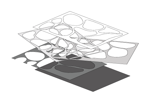
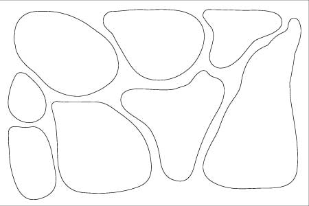
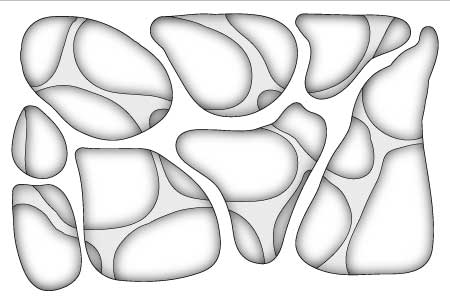
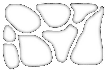
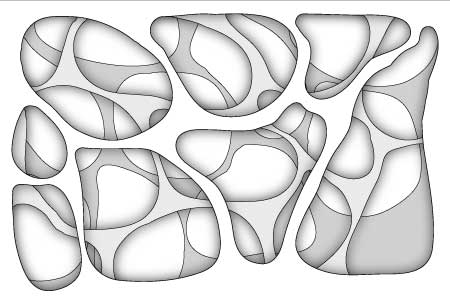
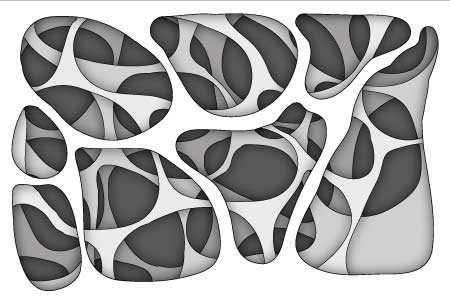
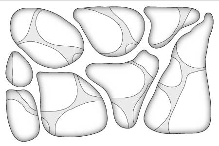
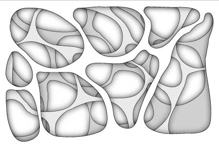
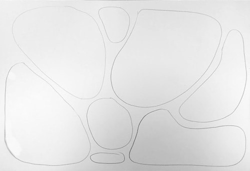
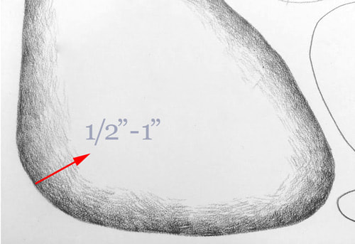
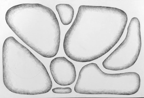
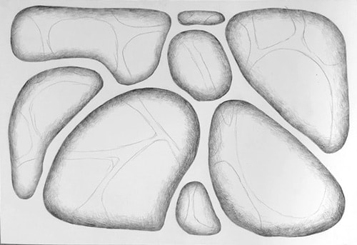
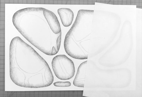
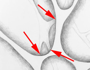
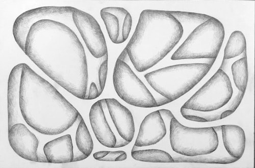
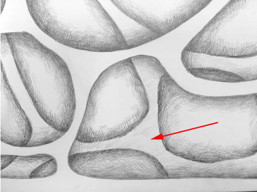
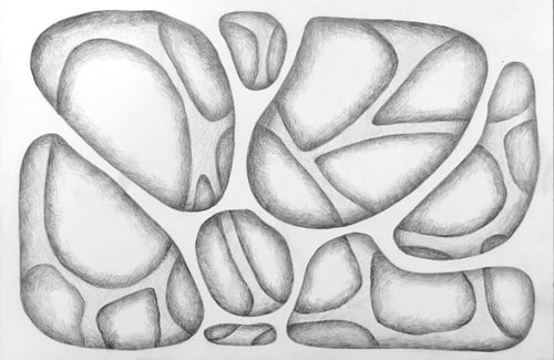
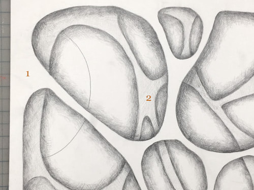
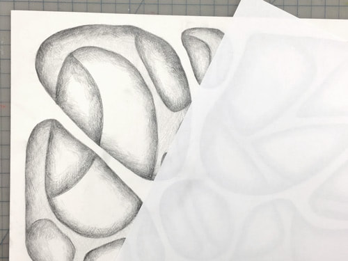
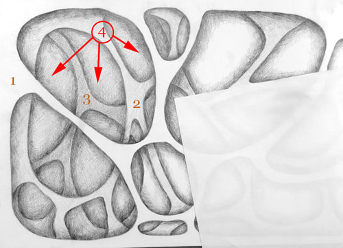
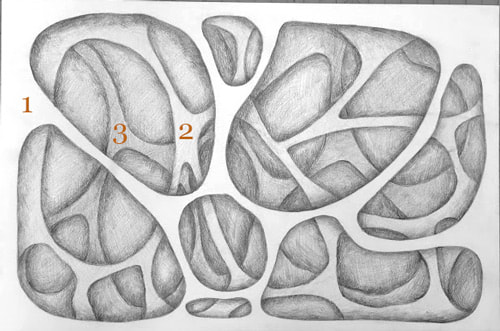
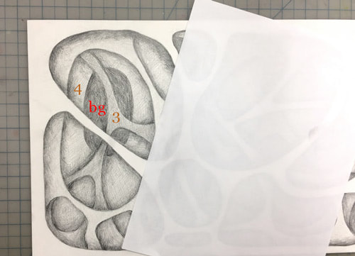
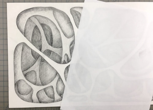
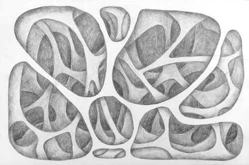
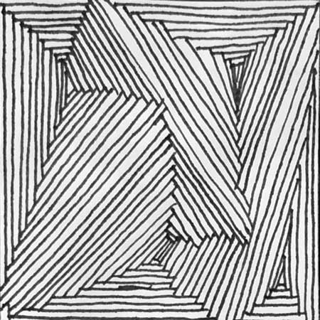
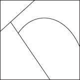
Inventing your own designs
Step by Step Directions

Step One:  
Start with 3-4 random lines inside the square to break up the space. These can be straight lines or curves. Each line should start and end at the border of the design.
Placing these first lines – you divided the square into few areas.  Now you concentrate on one area at a time.
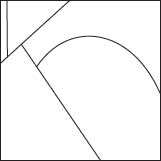
Picture
Step Two:  
​
Start placing lines parallel to the outline of the area.
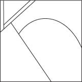
Picture
Step Three:  
​
Get them close together without having them touch (except at the ends).

Picture
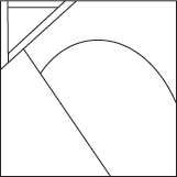
Step Four:  
You can do that in a circle, or use only select sides of the area, or use only 2 sides
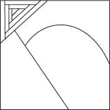
​

​​

Picture
Step Five:  
​
Once you are done with one area – move to the next
​​

Picture
  • ​Step Six:  ​
  • ​Continue the process until your design is done.​

Picture
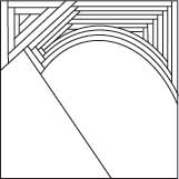
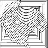
The worksheet contains 12 squares for you to design. I will be grading the top six designs that you indicate for me to grade. Use the entire 90 minute period to create as many designs as possible.  If you don't finish all 12 by the end of class, you may take the worksheet home and turn it in the next time we meet.  We will be moving on to the Optical Illusions with Line project once this activity is complete. 

2 Comments

Perceiving the Shape of Space

9/18/2017

0 Comments


L-Mode

Picture
Paul Cezanne "Boy with the Red Vest" 1890
Picture
Henri Matisse "Self Portrait" 1918
Picture
Paul Cezanne "Still Life with Plaster Cupid" 1895

R-Mode

Picture
Edgar Degas "L'Absinthe" 1875

Perceiving the Shape of Space, The Positive Aspects of Negative Space 

These next exercises will explore the contours of the positive forms and negative shapes in space.  If that doesn't make sense yet, just wait until we are done, and it will. Before we begin, ​let’s quickly review the five basic skills of drawing. Remember, these are perceptual skills:
The perception of • Edges (line of contour drawing) • Spaces (negative spaces) • Relationships (proportion and perspective) • Lights and shadows (shading)


What are negative spaces and positive forms?
Two terms traditionally used in art are “negative spaces” and “positive forms.” In the drawings of the bighorn sheep, for example, the sheep is the positive form and the sky behind and ground below the animal are the negative spaces. The word “negative” in negative spaces is a bit unfortunate because it carries, well, a negative connotation. I have searched in vain for a better term, so we’ll stick with this one. The terms negative spaces and positive forms have the advantage of being easy to remember and they are, after all, commonly used in the whole field of art and design. The main point is that negative spaces are just as important as the positive forms. For the person just learning to draw, they are perhaps more important!

Why is learning to see and draw negative spaces so important?
When a person just beginning in drawing tries to draw a chair, that person knows too much, in an L-mode sense, about chairs. For example, seats have to be big enough to hold a person; all four chair legs are usually all the same length; chair legs sit on a flat surface, and so forth. This knowledge does not help, and in fact can greatly hinder, drawing a chair. The reason is that, when seen from different angles, the visual information may not conform to what we know. Visually—that is, as seen on the plane—a chair seat may appear as a narrow strip, not nearly wide enough to sit on. The legs may appear to be all of different lengths. The curve of the back of a chair may appear to be entirely different from what we know it to be.  What are we to do? An answer: Don’t draw the chair at all! Instead, draw the spaces of the chair. Why does using negative space make drawing easier? I believe that it’s because you don’t know anything, in a verbal sense, about these spaces. Because you have no pre-existing memorized symbols for space-shapes, you can see them clearly and draw them correctly. Also, by focusing on negative spaces, you can cause L-mode again to drop out of the task, perhaps after a bit of protest: “Why are you looking at nothing? I do not deal with nothing! I can’t name it. It’s of no use … ” Soon, this chatter will cease—again, just what we want.


The Warm-up Activity:  L-Mode and R-Mode Thumbnail Sketches.

Step One:
In your journal, I will ask you to make a series of drawings using the 4 images to the left.  Begin by turning your journal horizontally, and  create two side by side rectangles that echo the proportions of  Cezanne's "Boy with the Red Vest". You can use a ruler to measure the rectangle on your screen, then use those measurements for your two rectangles. Neatly write the title of the painting at the top of your page.  Once you have finished this step, Please turn the page of your journal and repeat the steps for the next painting in our list titled "Self Portrait" by Henri Matisse.  Continue this step until you have set the stage for your study of all 4 paintings. 

Step Two:
After completing the directions in the first step, return to the Cezanne painting titled "Boy with the Red Vest". In the Left rectangle I want to you to spend 10 minutes creating a line drawing of what you see.  After  you have finished, I want you to do the same thing for  all bu the last image in the list. 

Step Three:
Once you have spent 30 minutes drawing the images in the list as you see them,  it's time to make the big shift over to the R-mode.  These paintings were chosen because they have figurative elements.  Faces have recognizable parts that the L-mode can easily label and symbolize.  Many of the drawings in the class were of what the students L-mode tricked them into thinking they were seeing.  It's likely that the students weren't really looking at the space around the figure because that's just not what the L-mode cares about. This next activity will force you to look not at the subject, but at the space surrounding the subject.

Move to the blank rectangle beside your drawing of Cezanne's "Boy with the Red Vest".  This time, I want you to draw only the shapes you see around the subject in the painting. Notice the areas where one color meets another, or where a lighter tone meets darker tone, and draw those differences as outlined shapes.  Take as much time to do this as you need until you've clearly defined All of the shapes in the negative space. 


Once you feel like you are finished with the first painting, move to the next.  Continue to draw these shapes in the negative space until you have completed both the "positive forms" and the "negative shapes" drawings  for the first three images in the list.   What you end up with should be a fairly clear visual of how your L-mode and R-mode dictate your vision. 

Step Four:

Now that you've seen the difference between how your L-mode and R-mode see, let's experiment with reversing the order of how we make these two drawings.  This time, I'd like you to start with the R-mode by drawing only the shapes in the negative space of  "L'Absinthe" by Edgar Degas.

Step Five:
The final step of this exercise is finishing the "positive forms" drawings for the final painting.  Because you began studying this painting in the R-mode, you will likely experience a shift in how you perceive the positive forms in this last  drawingx  As you draw, you may notice that you are now seeing, or at least more aware of both the positive and negative space in the painting.  In our next exercise, we will apply what we learned to drawings on a much larger scale and will be working from life rather than copying two dimensional images. 

0 Comments

Exam Review

5/31/2017

0 Comments

 
Picture
Picture

Demonstrate Knowledge of Negative Space.

For this section of the exam, you will be challenged to create a drawing by only drawing the shapes in the negative space.  We spent a lot of time doing this earlier in the year, because it helps an artist see the whole composition rather than only the subject.  This process was meant to help you see more, and I want you to demonstrate what you can see now that you've had a year of practice. 

You may want to practice, or at least re-visit the assignment page for this project before the exam to be sure you're actually seeing the shapes in the negative space. 


Demonstrate Understanding of One and Two Point Perspective. 
​

This portion of the exam will challenge you to demonstrate your understanding of linear perspective.  We spent a long time studying this aspect of art, and on the exam you will have to create a series of houses that are made in both one point and two point perspective.  Please see the official project page for the mixed media perspective assignment, as well as the tutorials about one-point and two-point perspective if you are not confident with these concepts. 
Picture

Discuss the 3 printmaking processes we studied this year.

There will a short answer section on the exam that requires you to describe (in detail) the process we used for Relief Printing, Mono-Printing, and Drypoint Etching.  As you describe these processes, you'll need to discuss the tools used, and the order of the procedures for each. 

Art Advocacy Essay

The final portion of your exam will require you to craft a well-written, succinct, and personal essay about the importance of art in education.  This essay should be written from personal experience and should also briefly address the research of Sir Ken Robinson (discussed in class earlier this year). 

View these YouTube links to better inform your essay:
Do Schools Kill Creativity
Changing Education Paradigms

Be aware of your spelling and grammar as you write. Essays entries should be a minimum of three paragraphs, and should be thoughtfully organized. It is highly recommended that you brainstorm and pre-write first.
0 Comments

Illusions of Form and Shape

10/21/2016

1 Comment

 
Picture
Picture
Picture
Picture
Picture
Picture
Picture
Picture
The Illusion of Form:
Drawings without Line

Most people in our culture have not been trained to see well enough to draw realistically, and  think drawing convincingly requires some God-given skill that cannot be learned.  You either have the ability or not, right?  Wrong! While it is true that some students have had more practice than others, or some have grown up in a culture of art, the ability to draw really comes down to the willingness to see. 

Leonardo is once wrote: "To draw is to learn to see".  He was absolutely right, as it takes deep concentrated observation to learn how to see well enough to render forms convincingly.  No differently than the dedicated work required for solving complex calculus problems or learning the subtle tone and nuance of a second language, learning to draw happens for those who have the desire to do difficult work.  Regardless of prior training or God-given "talent", any dedicated student can learn to create the illusion of form through the use of subtle light and shadow.

In our last project, we drew very open spaced objects and emphasized line to describe those objects. This next assignment will challenge you to create drawings of objects that contain no visible line. Instead, these drawings should only demonstrate a subtle range of values. 

Before we can begin the first stage of this assignment you should know that we will be using the same objects to create the illusion of flattened space using photography. The final product for those students who truly focus and are dedicated will be surprised at how illusionistic he or she can be.  In sense, you will be learning skills that will make many people outside the art room think you have a magical gift. 

Step One:  Choose An Interesting Object
Each student is required to bring in an object that can be painted completely white.  By painting the object completely white, we will be simplifying it, making the task of seeing light and shadow much easier. Not only will it help in creating a convincing illusion of form, but it will also simplify the objects enough to be able to really fool the eye with the photographic second stage of the assignment.   Choose your object wisely.  Too simple an object, and you'll be bored, to complex and you will risk frustration in both stages of the assignment. 

Using all of the object brought in, we will make a class still life of these white objects and will place them in an "in the round" arrangement with white cloth in the center of the room. 
​

Step Two:  The Ghost-like Structural Drawing 
​This is the most difficult portion of the assignment, as it requires constant evaluation of proper proportions.  The word proportion in art refers to the relative parts to the overall form within a drawing, painting, or sculpture. If the proportions are off, the illusion will be weakened. Without accurate proportion, the object will become distorted which will not allow the illusion to be convincing. Spend careful attention during this stage of the drawing.  One important trick during this structural stage is to keep your lines exceptionally light, so the structural evidence can be disguised when value is added later.   The biggest problem students face is having a light enough touch. I often tell my students that any pressure stronger than the weight of the pencil itself is too much in the beginning stages of a drawing. These drawings will be created on the same sized paper as we did in the last assignment.

Step Three:  Adding Value To Create The Form
Once your proportions are correct in your structural drawing, you will begin to add the value gradually.  We want to build this drawing slowly and carefully, using vine charcoal at first. Vine charcoal exceptionally malleable, meaning that it can be pushed around easily with a tissue or your finger, and can also be erased very easily with a good kneadable eraser. You should think of building this drawing in subtle layers that begin with the lightest value, and graduating to the darker values in the later stages of the drawing. Using the gradual build up of value will give you more control, and will allow you to add and subtract your values with ease. You should also know that your eraser is one of the best drawing tools you could have, not only in the sense that it can disguise your errors, but also in the way it can be used to remove values to produce highlights that create convincing forms.

Step Four:  Adding Line To Create Illusion of Flatness
Once you have convincingly created the illusion of form, it's time to really make some magic.  In this step you will be drawing line around the edges of your object, and will be photographing it on a pure white background.  With the proper lighting, we can create the illusion that the object has been drawn rather than photographed.   This step may take a little bit of editing in photoshop, but as you can see to the left, the results are a lot of fun. 
1 Comment
<<Previous

    ART 1
    Assignments

    This blog is the growing archive of Art 1 Assignments for DRHSART.  You can search assignments by category or date below. 

    Archives

    May 2023
    May 2022
    May 2021
    October 2020
    January 2019
    February 2018
    December 2017
    September 2017
    May 2017
    October 2016
    September 2016

    Categories

    All

    RSS Feed

Powered by Create your own unique website with customizable templates.